REDSIGN PROJECT
BHIM UPI: The Case Study
ROLE
UX Designer
Industry
Finance & Technology
TIMELINE
3 Weeks
The Unified Payments Interface (UPI), launched in 2016, has revolutionized digital transactions in India, particularly following the demonetization in November 2016. Its seamless real-time payment system, designed for mobile-first users, has rapidly outpaced traditional mobile wallets in transaction volume and value.
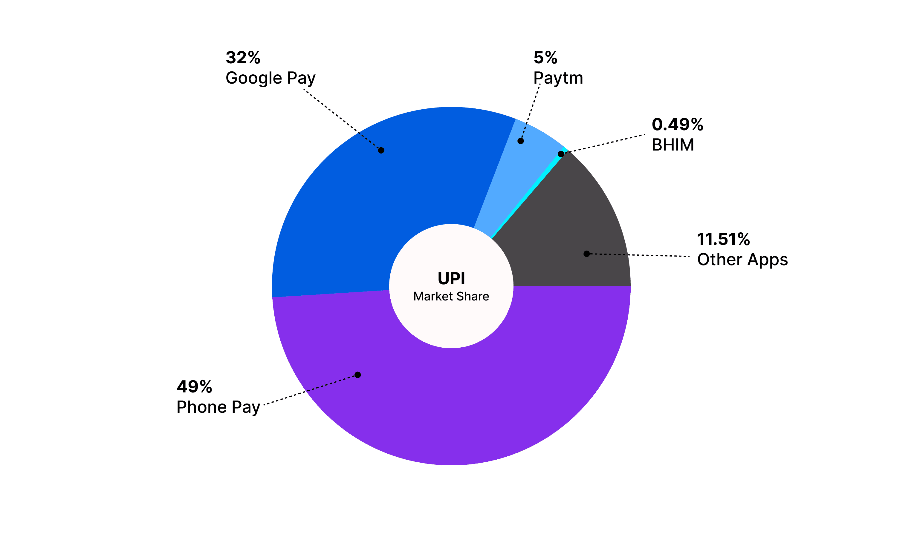
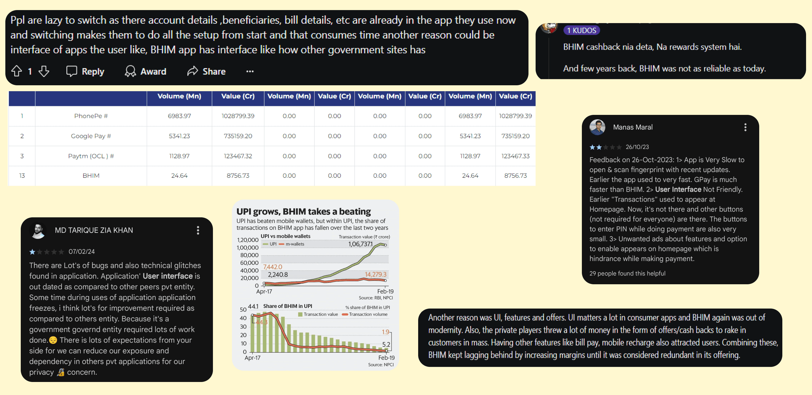
BHIM holds 0.49% of the UPI market share. There are many private UPI apps like PhonePe, Google Pay, and Paytm in the market, which dominate with an 86% combined market share. Despite the early success of the BHIM app, developed by the National Payments Corporation of India (NPCI), it now holds a meager 0.49% market share, ranking 13th among UPI apps.
This is a UX case study of the BHIM UPI App. However, The key focus here is to discover key factors that made BHIM UPI lose its market share and solve them in the redesigned app.
Overview: The BHIM UPI app, launched by NPCI in 2016, was one of the first to offer UPI services, aimed at simplifying digital payments in India. Despite its early success, the app has declined in usage over the years.
I started by creating a questionnaire for users of UPI applications. The key takeaways from this survey are bad user interface, limited incentives or offers, limited features, and lack of modernity.

Let’s start by analyzing the problem, below are a few conclusions from my analysis.
User Interface is too Bad
Prioritized unnecessary features and options
Too many colors are used in the app
Onboarding user flow is too lengthy
The app is not so user-friendly
Some security concerns (scan QR option on the lock screen)
So, Let's Redesign It…
At first, We initially streamlined the app’s color scheme to improve the user experience. We focused on using the primary color and its’ shades for most of the app’s design. Specifically, we reduced the app’s color palette to just two main colors and their shades: Blue (182C6B, D0DDFF) and Yellow (FFD78F) Base Color(EEF3FF). This approach simplifies the visual experience, making the app more visually appealing. Previously, the app’s design suffered from the use of too many colors, which created a cluttered and overwhelming interface. By streamlining the color scheme, we have created a more user-friendly design that enhances usability and aesthetic appeal.
Let's dive into the Bhim UPI App
Onboarding Redesign
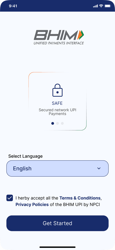
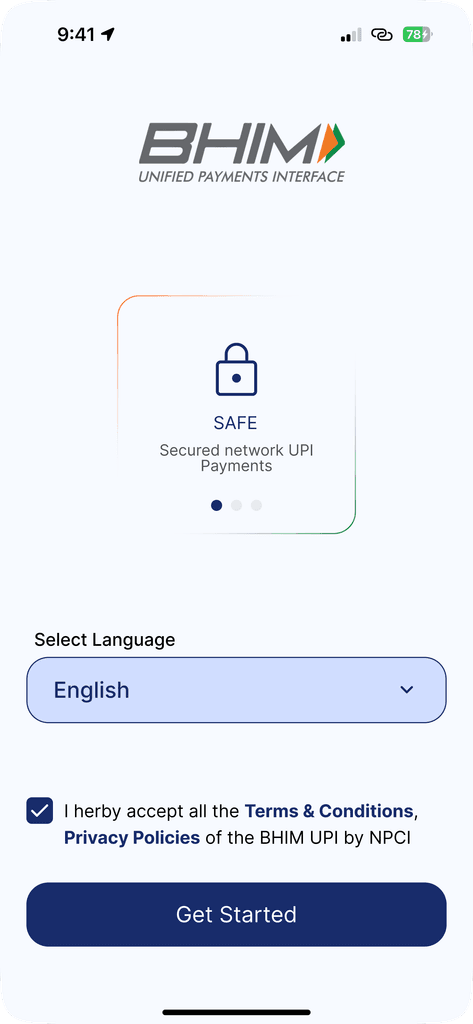
Page 1: Language Selection
When opening the app, Users immediately face a wide array of language options. Providing language choices is essential but dedicating an entire page to this purpose might overwhelm the user. The more options presented, the longer it takes users to make decisions. Instead, We’ll streamline this process by using a single dropdown menu.
Page 2: Onboarding Screen
The onboarding screen is crucial as it sets the tone for the user’s journey within the app. However, the current UI feels outdated and lacks the appeal that encourages users to proceed. Additionally, separating the onboarding from the language selection adds an unnecessary step in the user journey. By combining both screens, not only do we reduce cognitive load, but we also present a more modern interface that welcomes the user warmly.
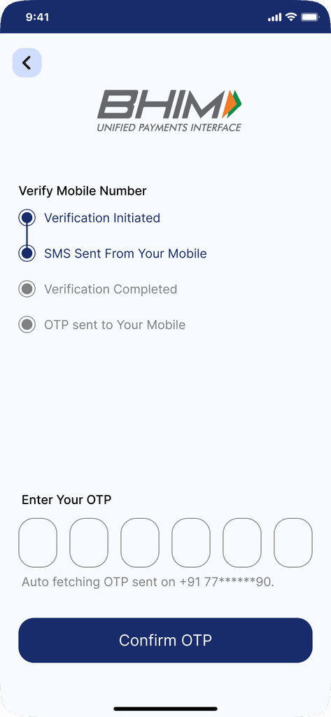
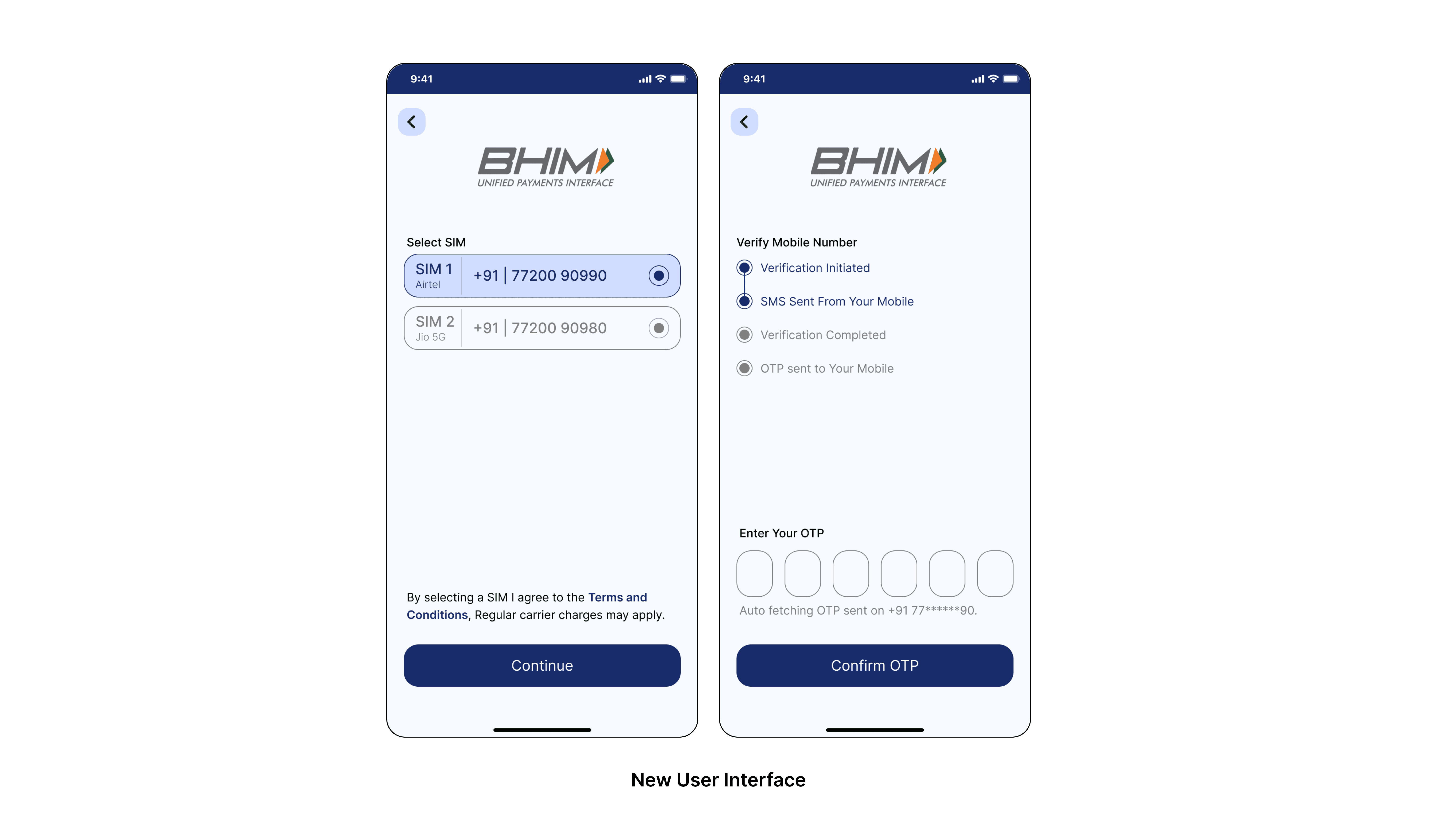
Page 3: Mobile Number Verification
Overlay for verification, Another Overlay for OTP. Why??
While overlays can be useful for quick tasks, they often come with several drawbacks on mobile devices like obscuring the underlying content, and limited space. So, we redesigned the mobile number verification and OTP progress as a full one-screen because it offers a more consistent and seamless user experience, enhancing accessibility and usability.
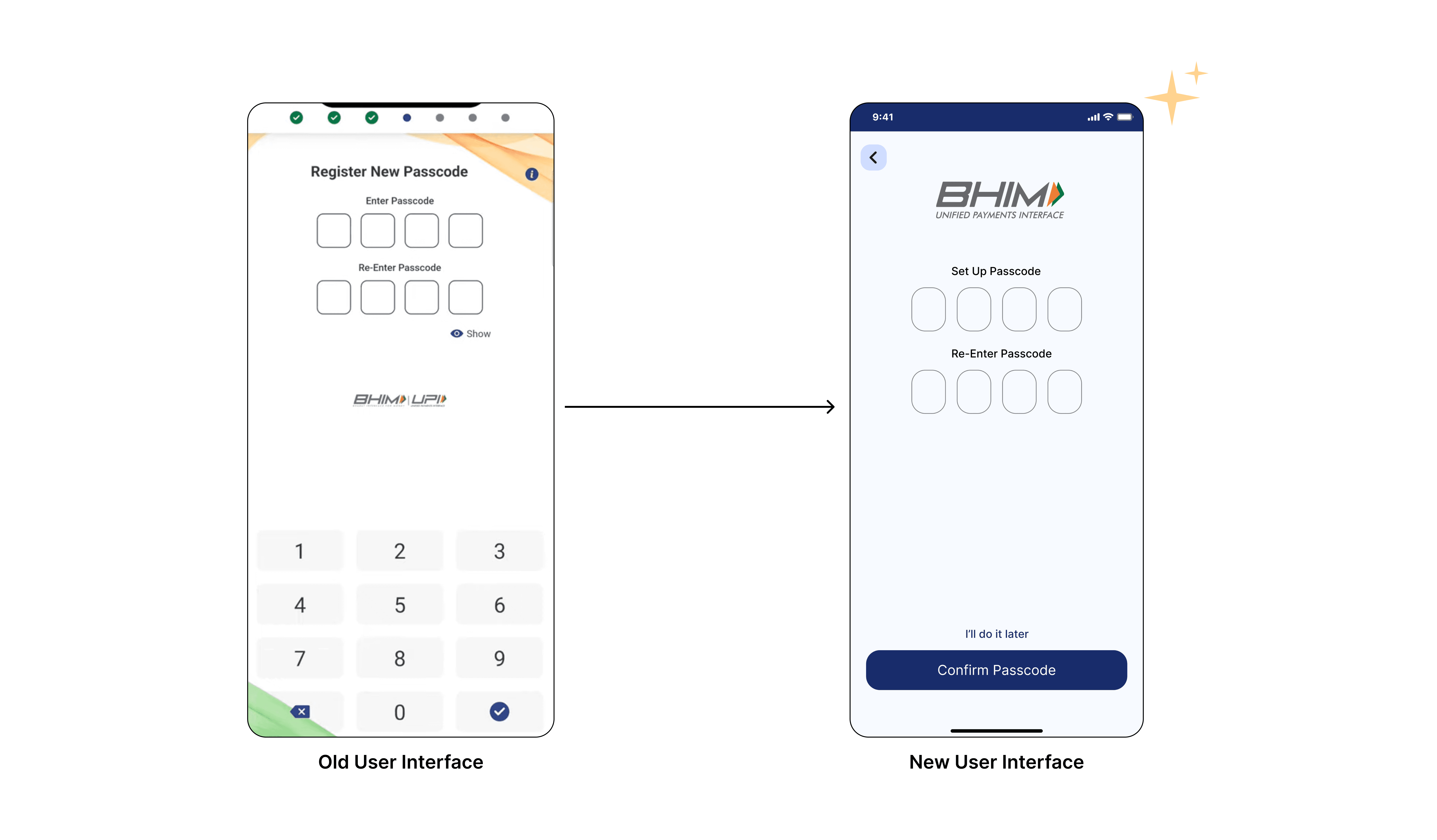
Page 4: Register New Passcode
The user is required to set a new passcode, with no option to skip. This can be inconvenient for the user who does not want a passcode. So, We’ve added an option to skip the passcode registration and complete it later. It gives flexibility and convenience to the user. To ensure users can continue smoothly while allowing them to set a passcode later without compromising security.
Page 5,6,7: Add Account (for payment)
The process of adding an account was spread across three separate pages. 1.) Select Account ➜ 2.) Select Bank Name ➜ 3.)Select Account Number
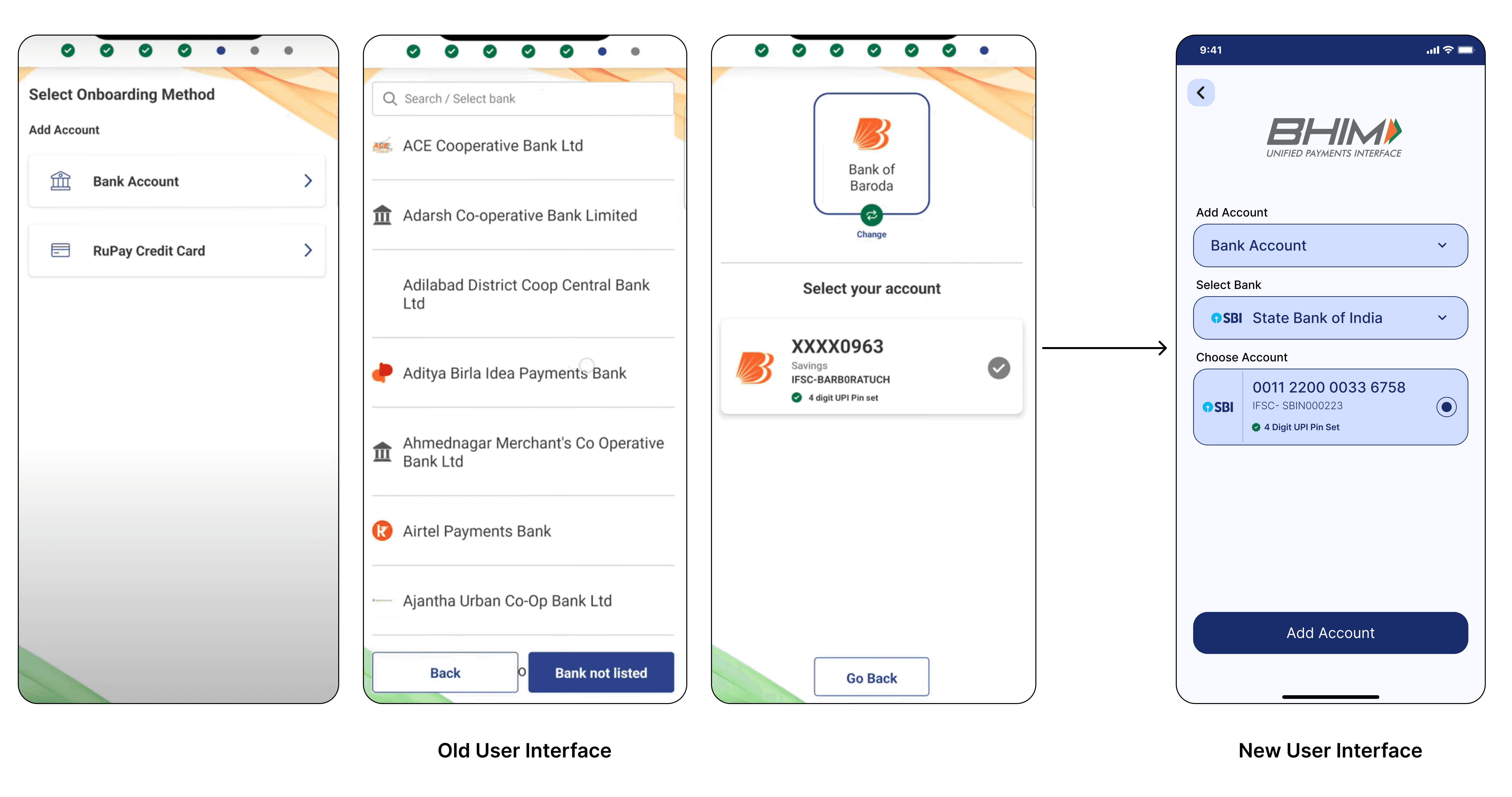
This process feels lengthy and leads to user frustration and drop-offs. So, We’ve redesigned these three pages into a single consolidated page. This simplifies the process, making it appear more user-friendly. By presenting all necessary fields — such as selecting the bank, choosing the account, and selecting the account number — on one page, users can complete the task more efficiently. This approach reduces the cognitive load and enhances the overall flow. The single-page design also maintains a clean and organized layout.
Wohooo!!! We’ve completed the initial account setup, Now we’ll be redirected to the homepage
. . .
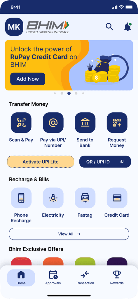
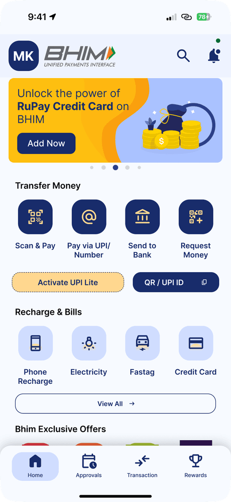
Homepage Redesign
Ahh!! Here we go with the Homepage. We’ve identified so many critical issues with the old UX of the homepage. Some major problems are:
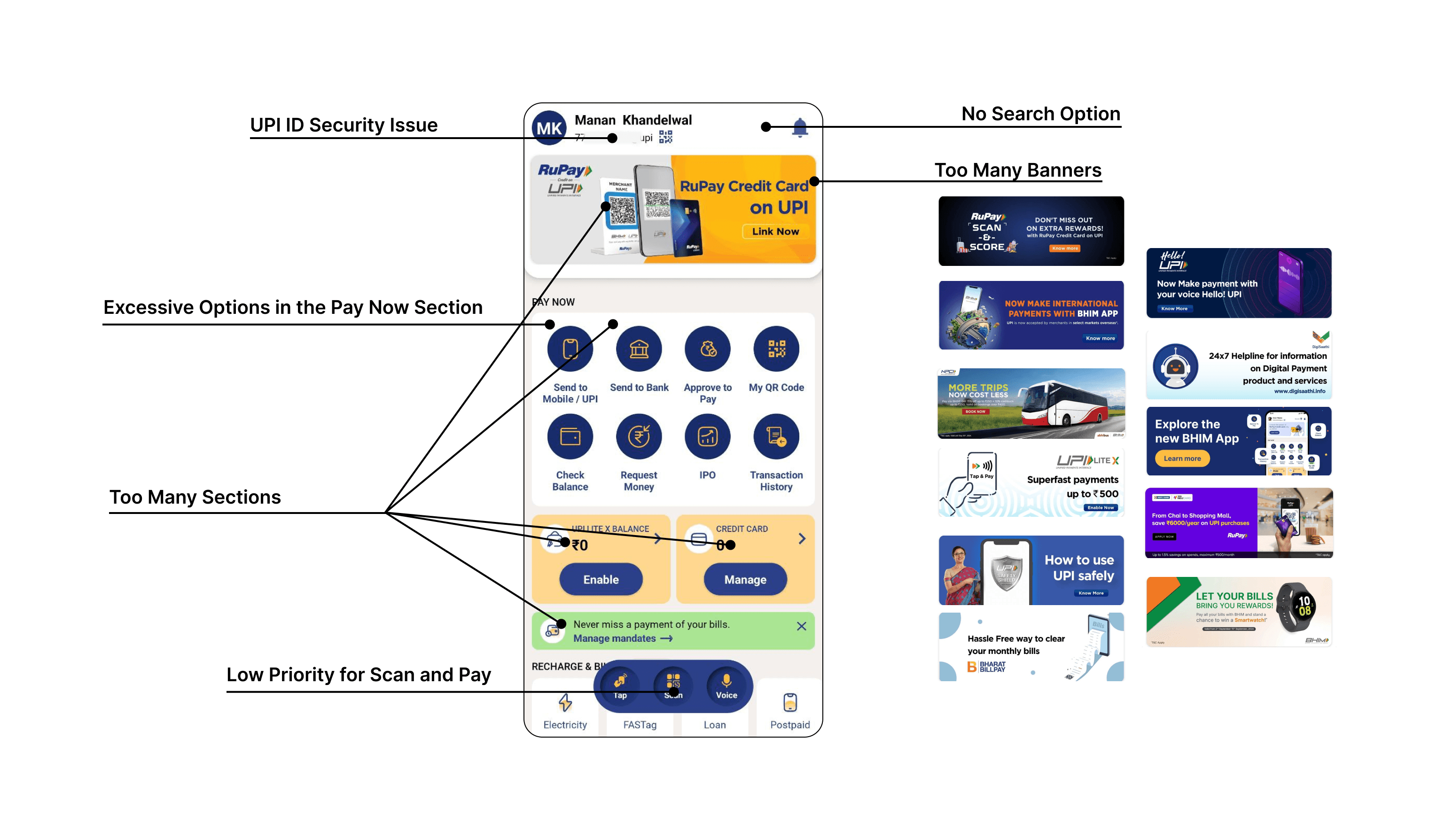
Low Priority for Scan and Pay: The “Scan and Pay” option was placed in the navbar with other options, without any special emphasis. Made it less noticeable and harder for users to access quickly, despite being one of the most frequently used features in UPI apps.
No Search Option: It is difficult for users to quickly find specific features or information without having the search option. This lack of functionality forced users to navigate through multiple screens and sections, increasing frustration and reducing overall efficiency.
Too Many Slides on Hero Banner: The hero banner contained too many slides, including offer banners that were almost negligible due to the excessive swiping required. This cluttered presentation diluted the impact of important promotions and made it harder for users to engage with the offers.
Excessive Options in Pay Now Section: The “Pay Now” section on the home page had too many options, many of which were not essential. This cluttered the interface and made it overwhelming for users to navigate, detracting from the overall user experience.
Security Issue with UPI ID Display: Displaying the UPI ID directly under the user’s name posed a security risk, especially since many users use their mobile numbers as their UPI IDs. This exposed sensitive information unnecessarily and could potentially lead to misuse. (Can be a security concern for high-profile individuals).
So, Let's Redesign It..
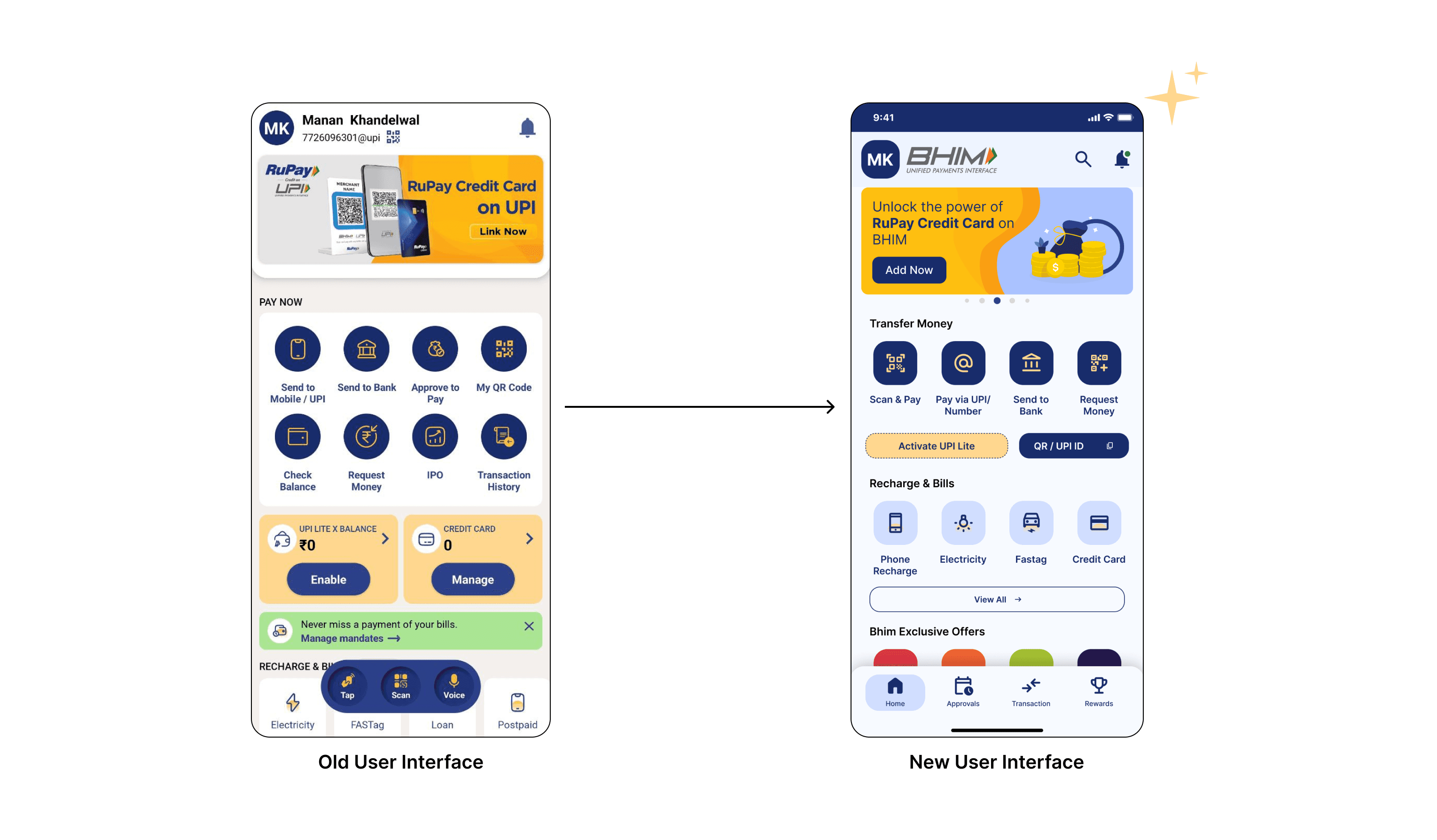
Search Option: The new design includes a search option, allowing users to find specific features or information quickly. This significantly enhances usability by providing a quick and efficient way to navigate the app.
Visibility for Scan and Pay: The “Scan and Pay” option is now given higher priority and is more prominently displayed. This makes it easier for users to access this frequently used feature quickly and efficiently with a subtle animation to make it more noticeable.
Streamlined Hero Banner: The hero banner has been streamlined to feature fewer slides (which were previously included in app feature promotion and other app offers too), Now a new offers section is added to the homepage to ensure that offers are more noticeable.
Pay Now Section: The “Pay Now” section has been decluttered, with only the most essential options prominently displayed. This creates a more streamlined and user-friendly interface, making it easier for users to navigate and complete transactions.
Improved Security for UPI ID: The new design addresses the security issue by not displaying the UPI ID directly under the user’s name. This helps protect sensitive information and enhances the overall security of the app.
Additional Changes
Introducing Reward System: By prominently displaying rewards, we aim to incentivize users to explore and utilize various app features, increasing user interaction and satisfaction. This addition enhances the overall user experience and also works as modern app design practices that prioritize user engagement and retention.
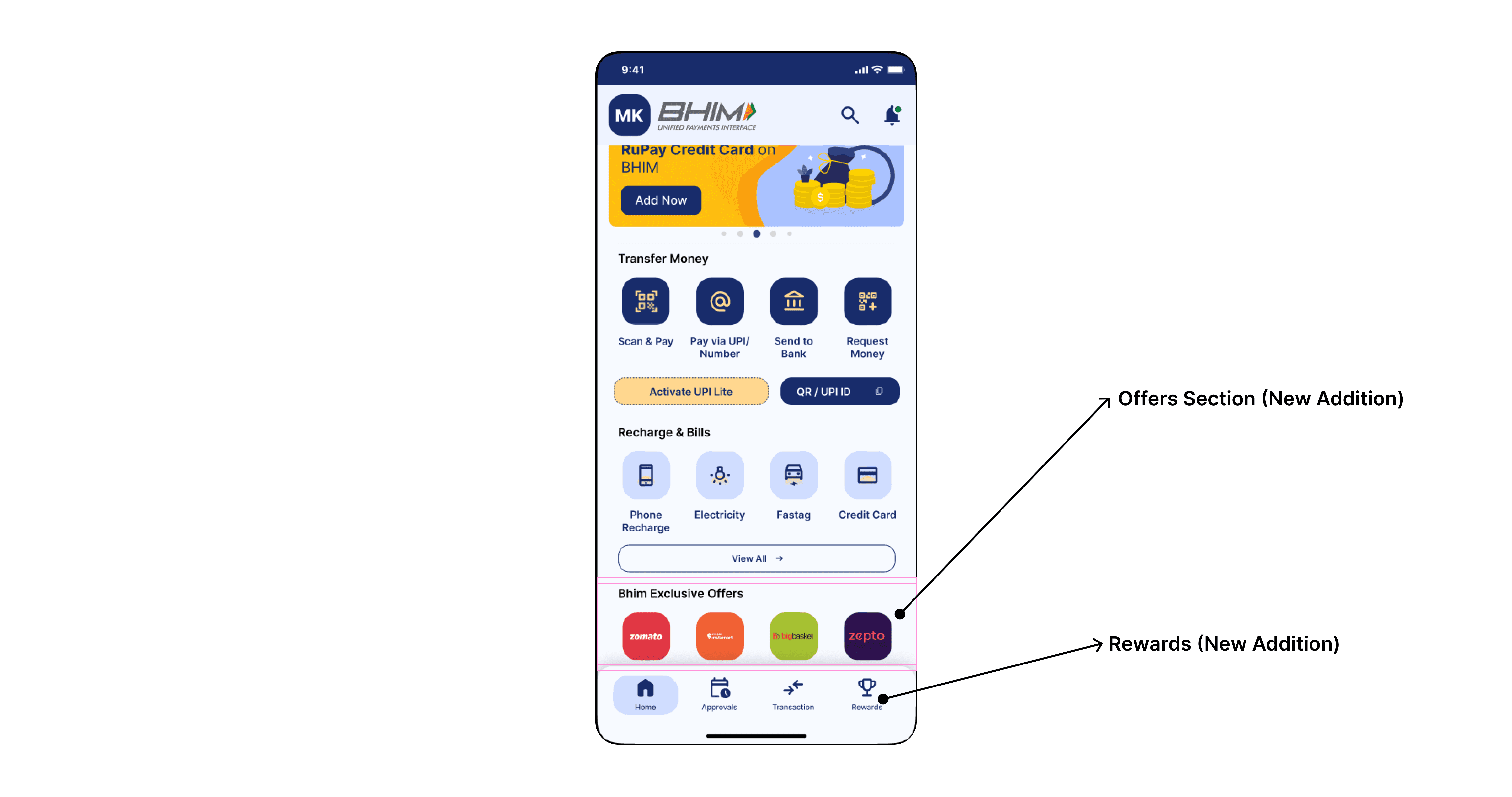
Introducing Offers Section: Adding an Offers Section enhances the visibility of promotional offers. Previously, these offers were buried within too many slides of the hero banner, making them hard to notice. Creating a separate Offers Section ensures that users can easily discover and engage with available deals without navigating through multiple slides. This approach increases user awareness of offers and contributes to a more engaging and rewarding user experience.
. . .
Menupage Redesign
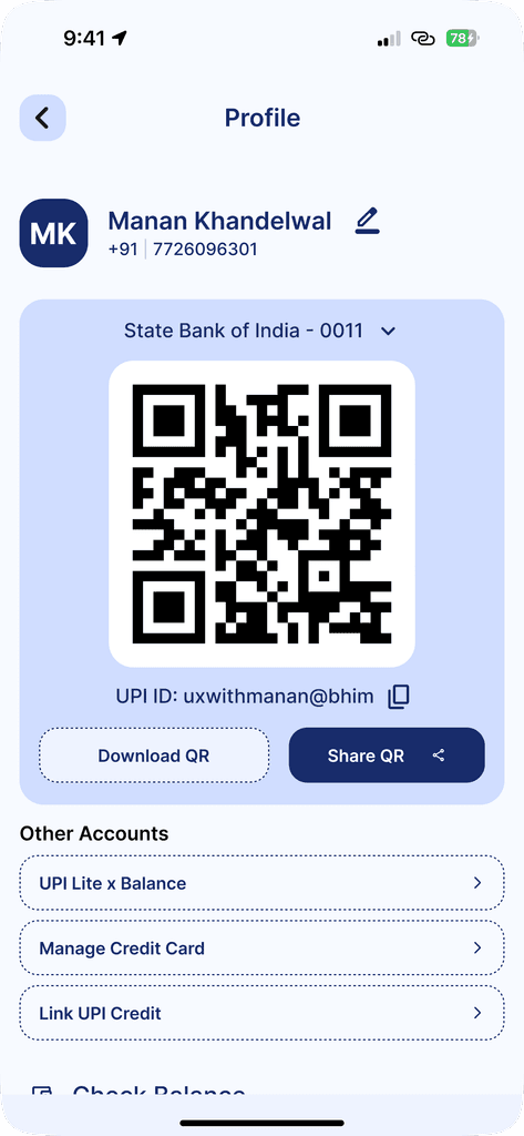
Issues with the old UX of the Menu Page :
Excessive Use of the Primary Color: The old menu page heavily used primary blue color. This resulted in a monotonous look, where important elements didn’t stand out, causing users to experience difficulty in quickly identifying key actions.
Too Much Contrast: The combination of stark white text and icons against the dark blue background created a high-contrast interface that could be visually overwhelming for some users. This sharp contrast made the interface feel harsh and tiring to look at.
Poor Space Optimization: The old layout is cluttered with an uneven distribution of elements. The small action buttons created an unbalanced look, making the page feel poorly structured. The account and UPI information sections were cramped, which added to the lack of organization.
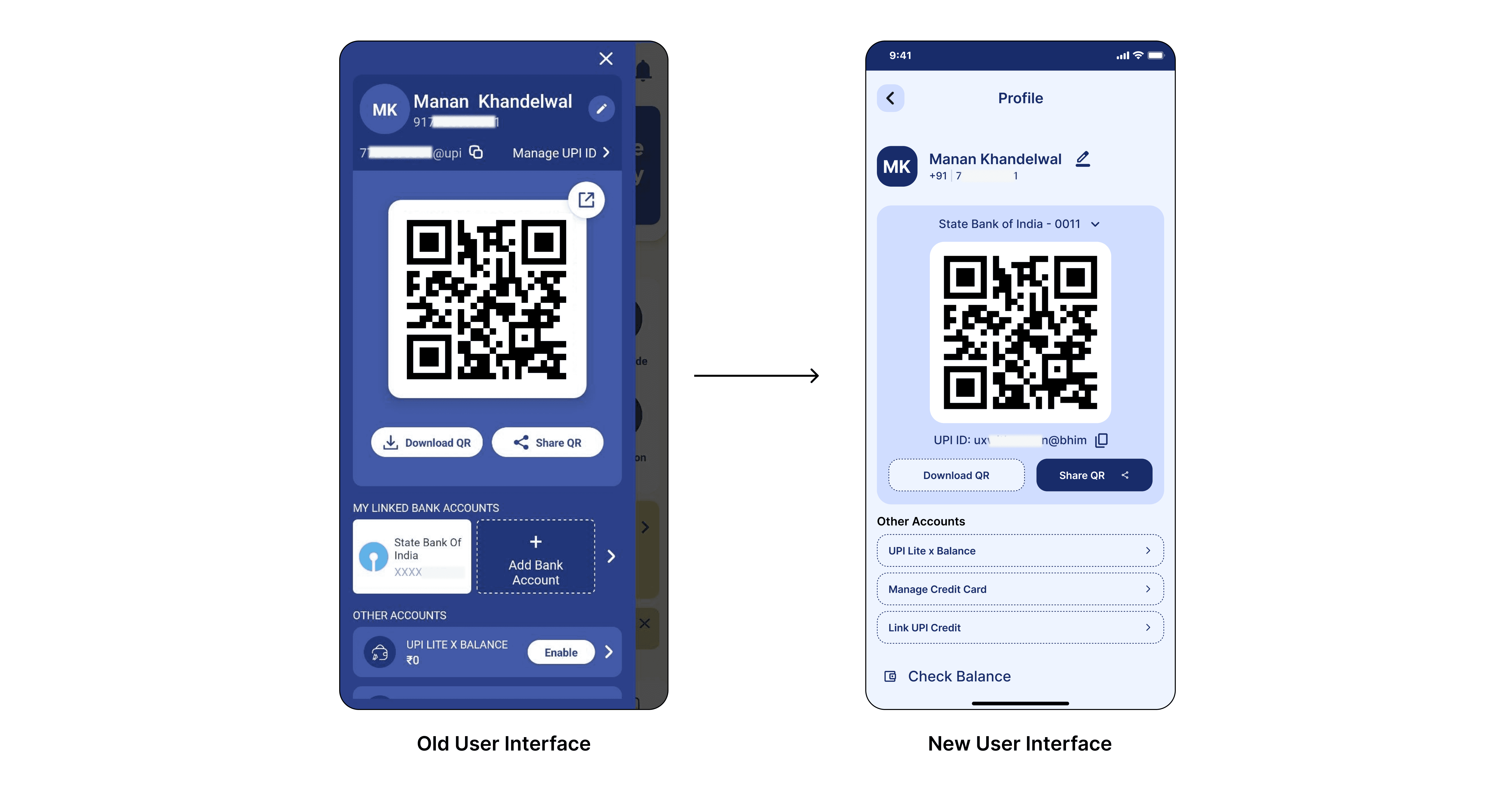
Redesigned Menu Page
Balanced Use of the Primary Color: The primary color is reserved for key elements like headers, important actions, and visual highlights. The rest of the interface uses a neutral, light blue background. This ensures that design is easier on the eyes while allowing important features to stand out more.
Softened Contrast: Contrast reduced to make the interface more visually comfortable. Offering a more pleasant viewing experience without compromising readability. The reduced contrast helps create a more harmonious look, enhancing user engagement without overwhelming the senses.
Improved Space Optimization: A more compact and well-organized layout like the profile information, QR code, and action buttons are grouped logically and spaced evenly. This improved the flow of the page and created a cleaner look, easier for users to focus on the essential tasks without distractions from poor spacing. The updated design also better utilizes the space for account information.
. . .
Conclusion
Summary of Findings :
Cluttered Interface with Poor Visual Hierarchy: The BHIM app suffered from a cluttered user interface with too many colors, making it difficult for users to focus on important features. Excessive use of the primary color throughout the interface created a lack of contrast, leading to poor visual hierarchy and causing key actions to blend into the background.
Overcomplicated and Lengthy Onboarding Process: The onboarding flow had multiple unnecessary steps, leading to user frustration and drop-offs. Users had to navigate through a series of overlays and fragmented screens, which added unnecessary complexity to the initial setup.
Low Emphasis on Key Features (e.g., Scan and Pay): Critical features, like “Scan and Pay,” were buried within the navigation bar alongside less essential options. This made it harder for users to quickly access one of the most frequently used features in UPI apps, diminishing overall usability and convenience.
Lack of Search Functionality: The absence of a search bar made it difficult for users to find specific features or information quickly. Users had to navigate through multiple sections, increasing frustration, especially when trying to locate specific payment options or app functions.
Outdated Design with Minimal User Incentives: User interface of the app feels outdated, lacks modern elements to engage or incentivize users, with no rewards or offers visible, making the app less appealing in comparison to competitors like Google Pay or PhonePe, which heavily promote rewards and cashback to boost user engagement.
Excessive Options in the “Pay Now” Section: The “Pay Now” section included too many payment options, many of which were not essential for users, making it difficult for users to quickly identify what actions to take.
Security Concerns with UPI ID Display: The app displayed the UPI ID directly under the user’s name, which posed a potential security threat, particularly because many users had mobile numbers as their UPI IDs. This unnecessary exposure of sensitive information increased the risk of misuse.
Overuse of Hero Banner Slides: The homepage featured a large hero banner with too many promotional slides. The excessive number of slides diluted the importance of each promotion, requiring users to swipe through multiple slides, which reduced their engagement with key offers or information.
Poor Space Optimization in the Menu Page: The menu page had uneven space distribution, with excessive space around the QR code and cramped sections for account and UPI information. This created a disorganized and unbalanced layout.
Too Much Contrast Leading to Visual Fatigue: The combination of bright white text and icons against a dark blue background created too much contrast, which made the interface visually harsh and difficult to look at.
. . .
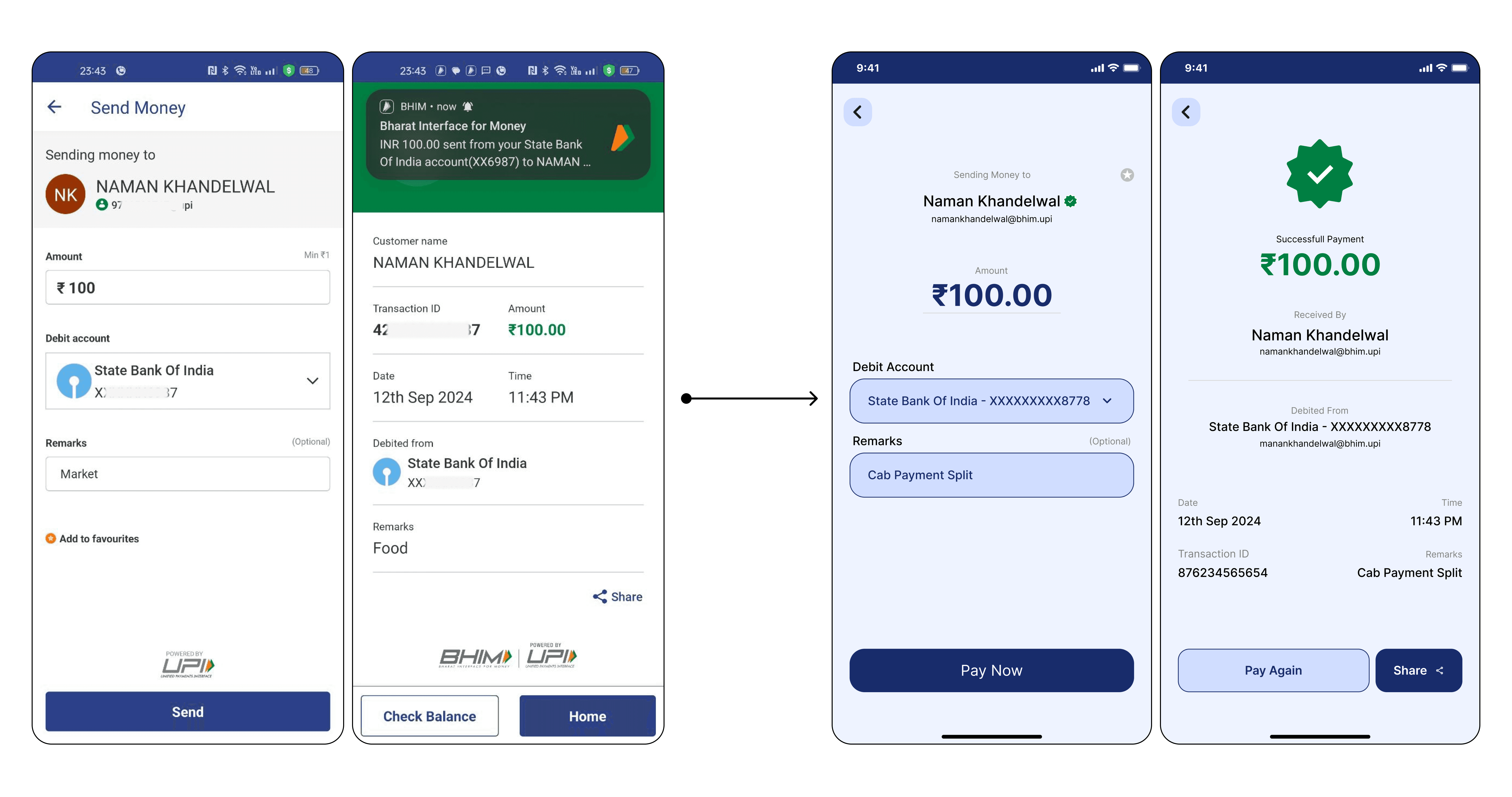
Other Screen Redesign
Beyond The UX
There were several external factors contributed to the decline of the BHIM UPI app:
Early Instability of UPI Technology: When UPI was first launched, the technology was still in its early stages and was faced with frequent transaction failures, slow response time, and large downtimes. Since BHIM was the first app to offer UPI services, users directly associated these technical issues with the BHIM app itself, leading to a perception that BHIM was a suboptimal and unreliable payment platform.
Poor Timing and Competition from Private Players: When UPI technology stabilized, private companies like PhonePe, Google Pay, and Paytm had entered the UPI market with robust, feature-rich apps. These private players were able to capitalize on a more stable UPI ecosystem and launch their apps without facing the technical issues that plagued BHIM. They gained a more positive reception, while BHIM struggled.
Challenges in Attracting New Users: BHIM faced difficulty in attracting new users at scale. Private UPI apps quickly adopted aggressive marketing strategies, offering incentives like cashback, rewards, and discounts to engage users. BHIM, on the other hand, failed to do so.
Public Perception and Brand Image: As a government-developed app, BHIM was positioned as a reliable tool for digital payments, but it lacked brand appeal. Private apps gained traction with better user interfaces, attractive offers, and seamless experiences